Uniqlo Website IA Redesign
Uniqlo's e-commerce traffic was growing 30.3% year over year, but the site underneath it was fighting its own shoppers: inconsistent categorization, duplicate menu items, and a search bar that returned the wrong department entirely. I audited the IA through 10 user interviews and proposed a restructure grounded in what people actually tried to do.
Project Details
Three things the site made harder than they needed to be
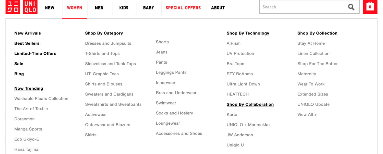
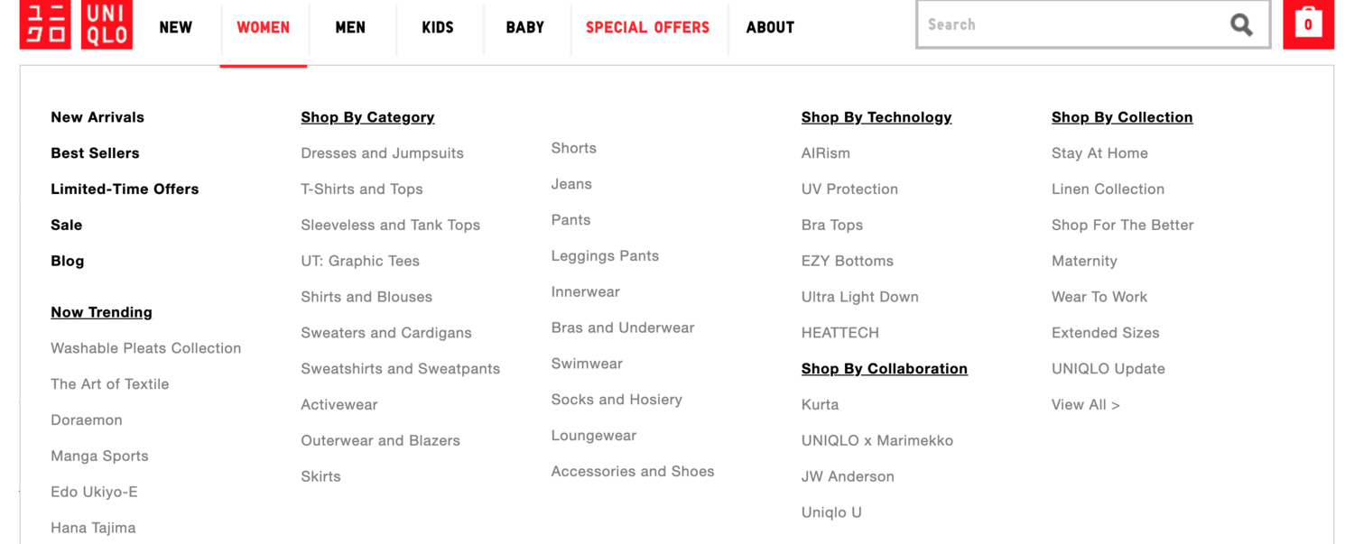
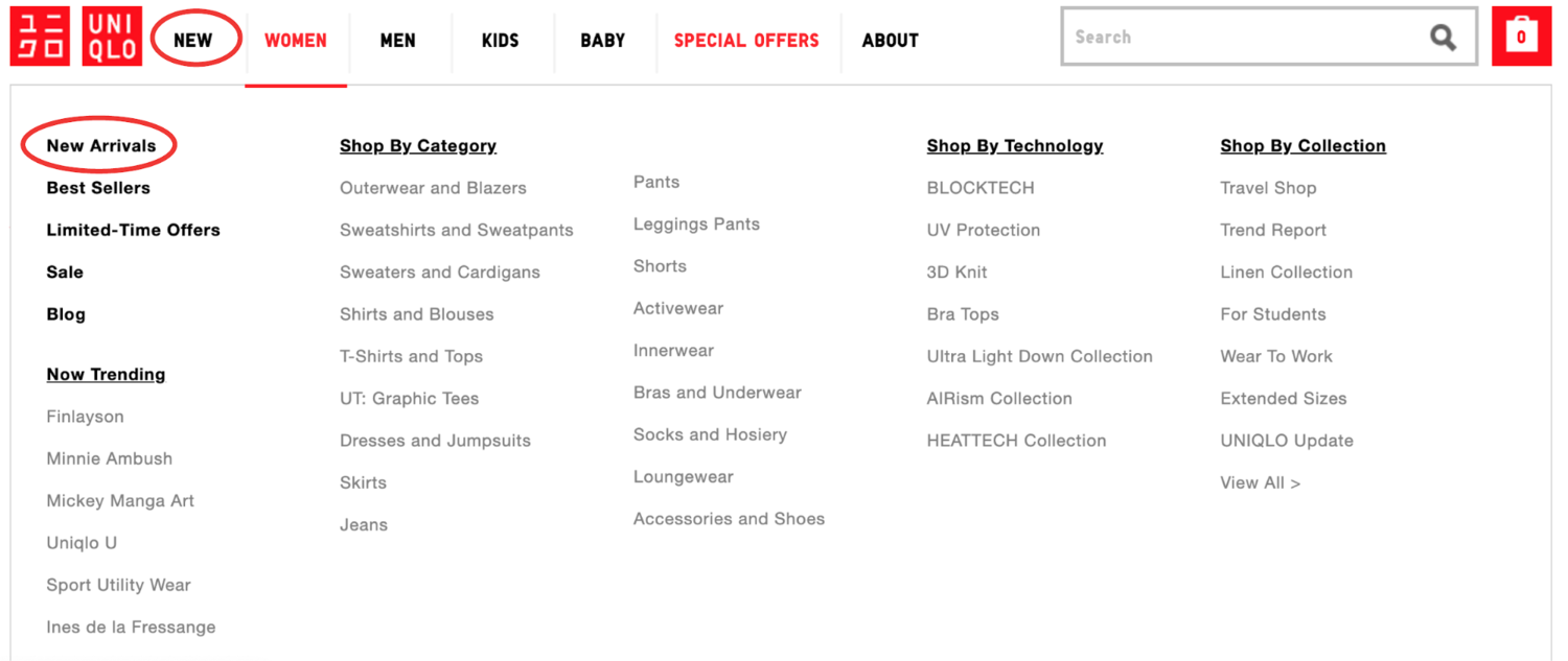
Navigation was inconsistently organized. Some categories were sorted alphabetically, others thematically, with no visible logic for which rule applied where. Shoppers had to relearn the system on every visit.
Menu items duplicated each other. "New Arrivals" and "New" sat side by side, pointing at overlapping content, adding a decision shoppers didn't need to make.
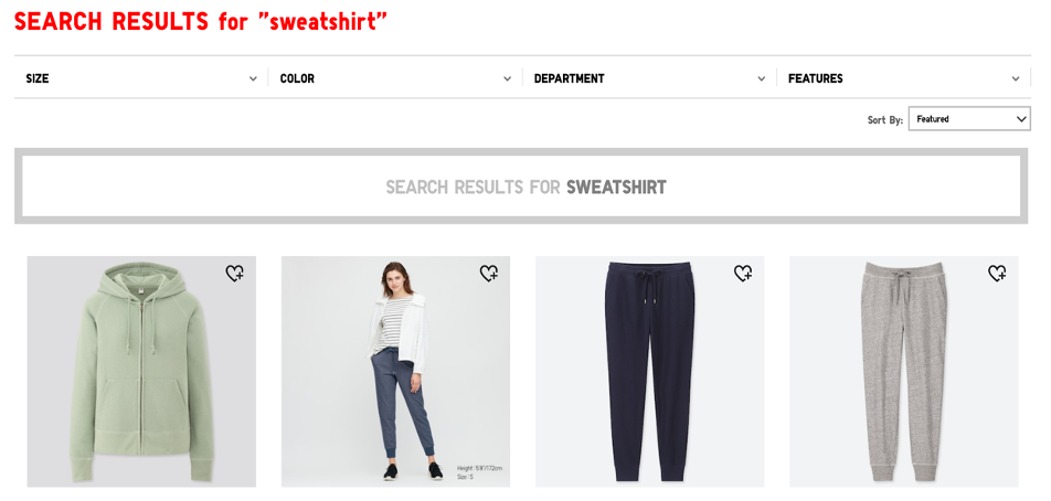
Search returned the wrong department. Searching "sweatshirt" surfaced women's outerwear and sweatpants ahead of anything resembling a sweatshirt, forcing people to fall back on manual browsing.
Three shoppers with three different relationships to the brand.
Enthusiastic followers who stay updated on brand collaborations and product releases, but don't necessarily purchase frequently. They navigate by knowledge of the brand, not by the site's labeling.
Occasional shoppers who visit mainly during sales, relying on past shopping experience to find their way around rather than the current navigation structure.
Users who recognize the brand but have minimal interaction with it, often arriving after accompanying someone else to a physical store. They have no accumulated site knowledge to fall back on.
10 interviews, spanning brand insiders to first-time visitors.
The range mattered: the site worked reasonably well for people who already carried brand knowledge in their heads. It broke down for everyone else, and that gap doesn't show up if you only test with people who already know the brand.
Understanding what belonged in a "collection" required already knowing the brand's collaboration history. The site's Z-pattern layout wasn't built for content that depends on prior context to parse.
For Insiders and Fans, navigation was thorough and cross-referencing between related items worked well. The system wasn't broken, it was just gated behind familiarity.
Every weakness traced back to labeling and structure, not missing information. The content shoppers needed already existed on the site; they just couldn't find the door to it.
Three findings. Three structural changes.
A hybrid categorization scheme
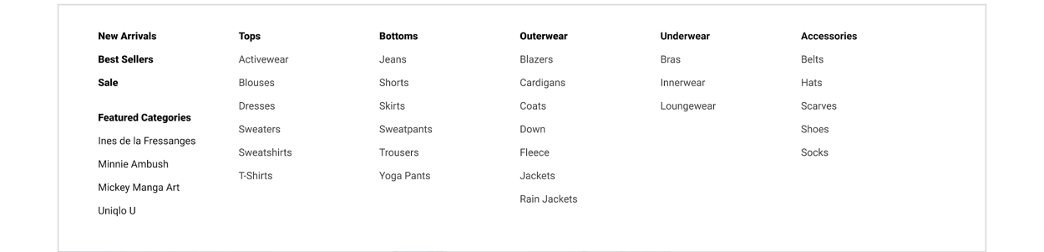
Main categories (Tops, Bottoms, Accessories) stay topically grouped, since that's how shoppers think about clothing at the top level. Subcategories underneath switch to alphabetical ordering, so scanning for a specific item doesn't depend on knowing which theme it was filed under.
A labeling system that doesn't require insider knowledge
The vague "Trend Report" tab is replaced with a dedicated "Collections" category that consolidates collaborations, branded technologies like Heattech, and seasonal offerings in one legible place. Trending items that don't belong to a collection move back into Men's, Women's, and Kids', where shoppers already expect to find them.


A sitemap built around entry points, not just structure
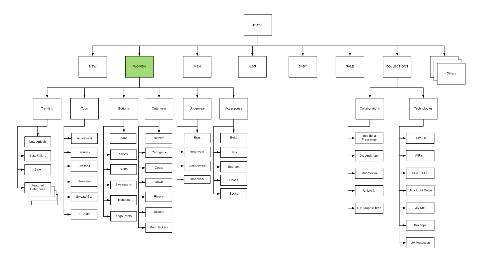
The optimized sitemap adds a dedicated "Collections" menu tab, simplifies dropdowns into broader clothing categories, and creates clearer entry points for the product lines that don't fit neatly into Men's, Women's, or Kids'.
What this project shows
By addressing these structural issues, the goal was a more intuitive, efficient experience for all Uniqlo shoppers, whether they're brand enthusiasts, casual buyers, or first-time visitors. The recurring theme across interviews wasn't missing content, it was a system that only worked if you already understood it.
Implementing the hybrid categorization, refined labeling, and optimized sitemap targets discoverability directly: reducing the friction between what a shopper is looking for and what the site calls it.
Archived from 2020. Originally on Squarespace; migrated here as part of portfolio consolidation.