Philips Hue App Redesign
The Philips Hue app works, but managing multiple bridges, catching update alerts, and building custom automations all required more steps than they should. I redesigned three specific flows based on patterns found through 10 user interviews.
Project Details
Three things the original app made too hard
Bridge management was buried. Users with more than one bridge (separate lighting zones, multiple homes) had no unified overview. Reaching the right context meant navigating settings each time.
Update alerts were easy to miss. The app gave no persistent, actionable signal when the bridge needed a firmware update. Users discovered the problem after something stopped working.
Automation was all-or-nothing. Custom triggers were limited to built-in presets. Users who wanted to combine a time condition with a location trigger had no way to do it; the builder didn't support stacking.
Two users whose frustrations shaped every decision.
Loyal Philips Hue user managing lighting across her home. As she added more zones, she bought a second bridge. What used to feel seamless started requiring extra effort to navigate.
- Unified dashboard for all connected bridges
- Quick brightness and scene adjustments
- Stay informed about firmware updates before something breaks
- Bridges don't communicate; switching requires navigating settings
- Update notifications are unclear and easy to miss
- Common adjustments buried too many taps deep
A tech-savvy professional new to Philips Hue. He came with clear intentions (automations, gaming scenes, smart assistant integration) and found the app didn't match his expectations for a premium smart home product.
- Time-based automations (lights on at 8AM weekdays)
- Custom gaming room scenes
- Smooth integration with Alexa and Google Assistant
- Automation setup is hard to find and confusingly labeled
- Preset values are unclear; stacking conditions isn't possible
- Integrations break silently after app updates or outages
10 interviews, ages 25–50, across varying degrees of smart home experience.
Participants ranged from casual users who adjusted brightness once a day to people managing multi-room scenes and automations. The range mattered: problems that only surface at scale weren't visible in casual use.
Participants consistently wanted fewer taps for the actions they performed most often. Adjusting brightness shouldn't require digging into a settings hierarchy every time.
Users who wanted to automate their lighting hit walls quickly. Preset labels were unclear, condition types were limited, and stacking rules (time AND location) wasn't possible at all.
Participants managing multiple rooms or bridges struggled to keep things organized. The lack of a unified overview meant context-switching was a constant part of controlling their lighting.
Even power users preferred clean hierarchy over information-dense screens. More options visible at once didn't feel like control. It felt like overhead.
Three friction points. Three design decisions.
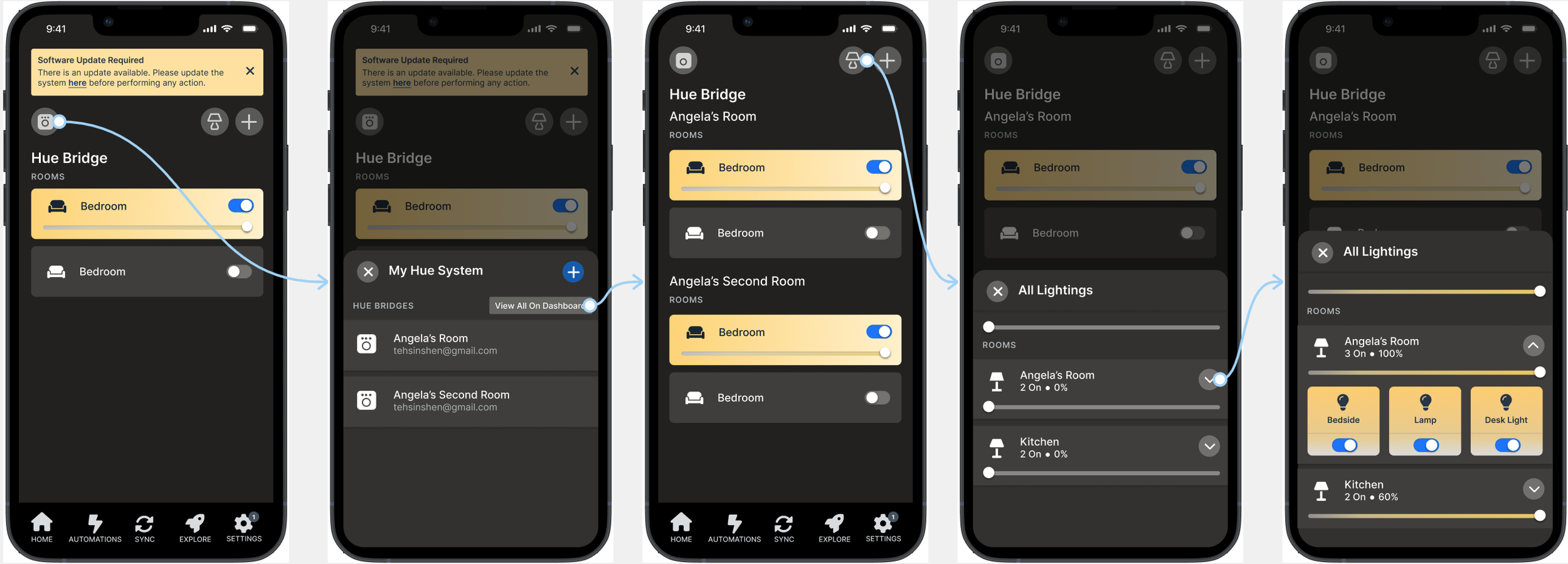
Unified bridge dashboard
Abby's bridges don't communicate with each other. Every time she needs to switch between lighting zones, she has to manually navigate through settings to change contexts, a friction that compounds every single day.
Instead of requiring users to switch bridges through a settings menu, I designed a home screen that shows all bridges simultaneously. A "View All on Dashboard" toggle makes the full multi-bridge overview available on first open, with no extra navigation.
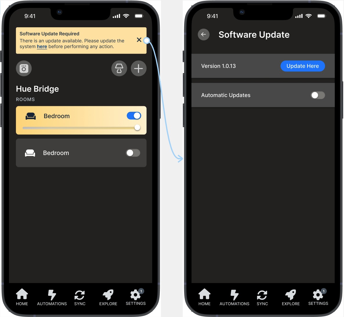
In-app update banner
Abby encountered an unexpected error trying to adjust brightness. The cause turned out to be an outdated app version — something she had no way to know until the feature stopped working entirely.
When a firmware update is required, a persistent banner now appears in the main view with a direct link to the software page. The update is visible before anything breaks, not discovered after the fact.
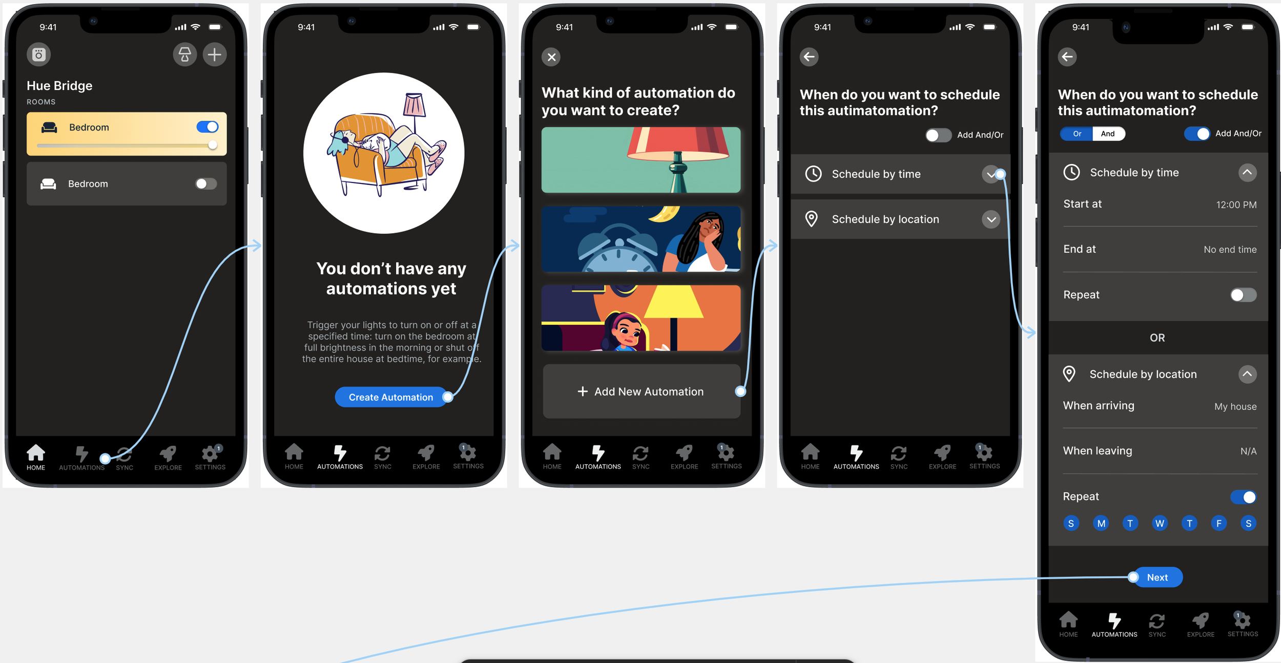
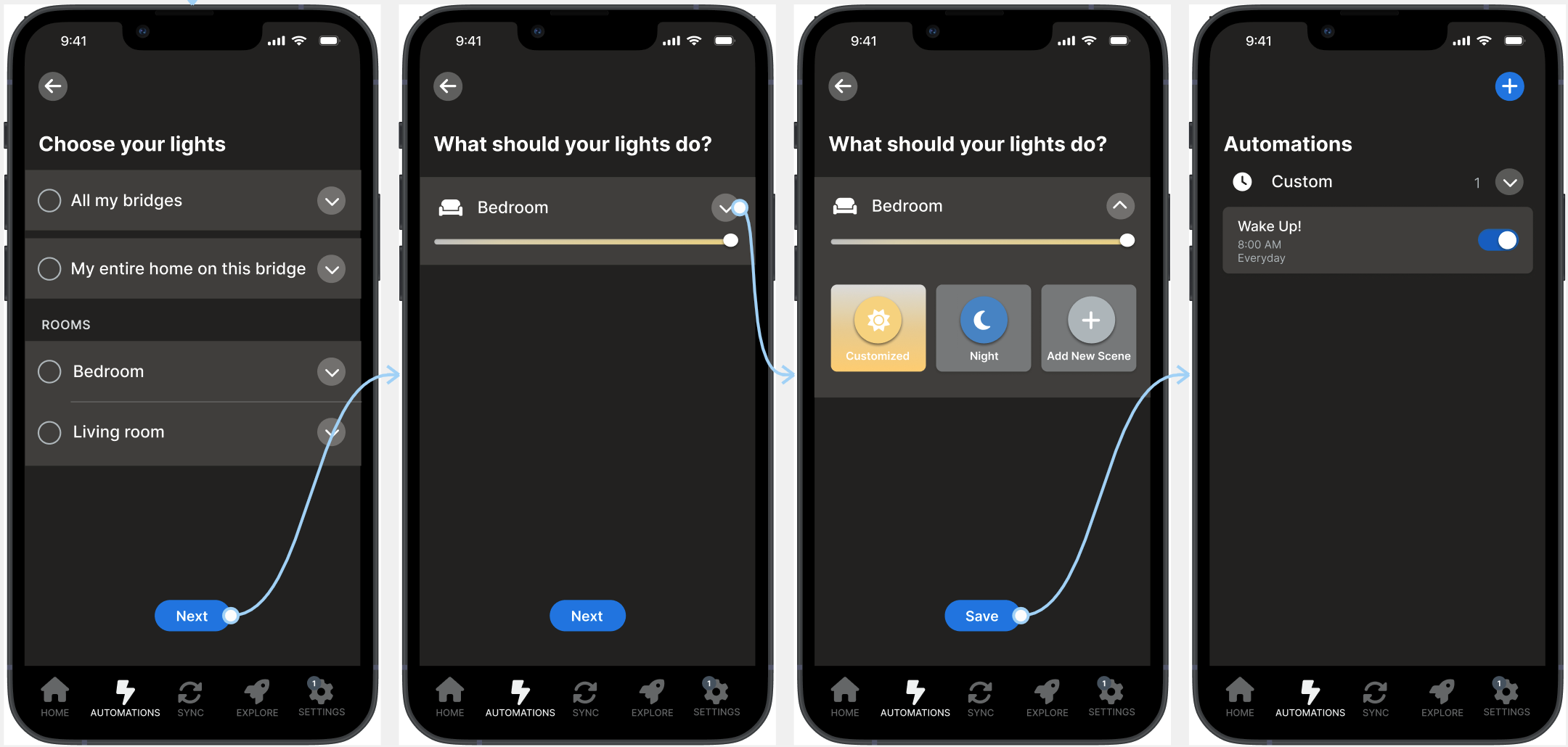
Flexible automation triggers
Tom wants lights on at 8AM on weekdays. The automation option was hard to find, and once he found it, confusing labels and unclear preset values left him guessing. Stacking a time condition with a location condition simply wasn't possible.
The redesigned automation builder lets users combine conditions using AND/OR logic: time, location, and device state can stack together. "Turn on lights when I arrive home after 6pm" is now a single flow, not a workaround.
What this project shows
This was a self-directed redesign with no client brief and no shipping constraints. The three problems I focused on came directly from interview patterns, not from assumptions about what a smart home app should do. That discipline (ground the design problem in observed friction before proposing a fix) is the habit I've carried into subsequent work.
The prototype addressed each scenario but didn't go through usability testing. If I revisited this, I'd want to validate whether the AND/OR automation logic reads as control or as complexity for users encountering it for the first time. The capability is meaningful; the framing is what would need testing.
Archived from early 2025. Originally on Squarespace; migrated here as part of portfolio consolidation.